Janoski’s Farm | Site Design & Photography
After working for a local family-owned farm for a couple years, I began to extend my expertise in design in areas that I felt needed it most. As their business was growing, these updates were beyond necessary.
One project that came about due to a horrible wind storm & a broken sign. I saw this as an opportunity to prove myself to create a unique sign for the farm. After many versions and tweaks, the below can be found today at the entrance to the farm. It utilizes the new tractor logo at the top, and bold, clean, red typography which is classic to all the farm’s signage & color scheme.


The first major project I set out to help with was a much needed update of their website that was previously created using a more archaic builder. I had offered to help them update to a more modern platform which I built from the ground up using Wordpress & the Divi Theme builder. The reason for choosing this builder is because of frequent changes to the site throughout the season. The Divi builder allowed for pre-built modules to be saved into a library, so as seasons changed we could switch imagery for the Greenhouse, Garden Center & advertise the Pie Of The Month in the bakery or the Wine of the Month in the wine room. Easy user-friendly templates could allow for handoff to anyone without a great deal of technology know-how to update the site without my assistance should it need to be.
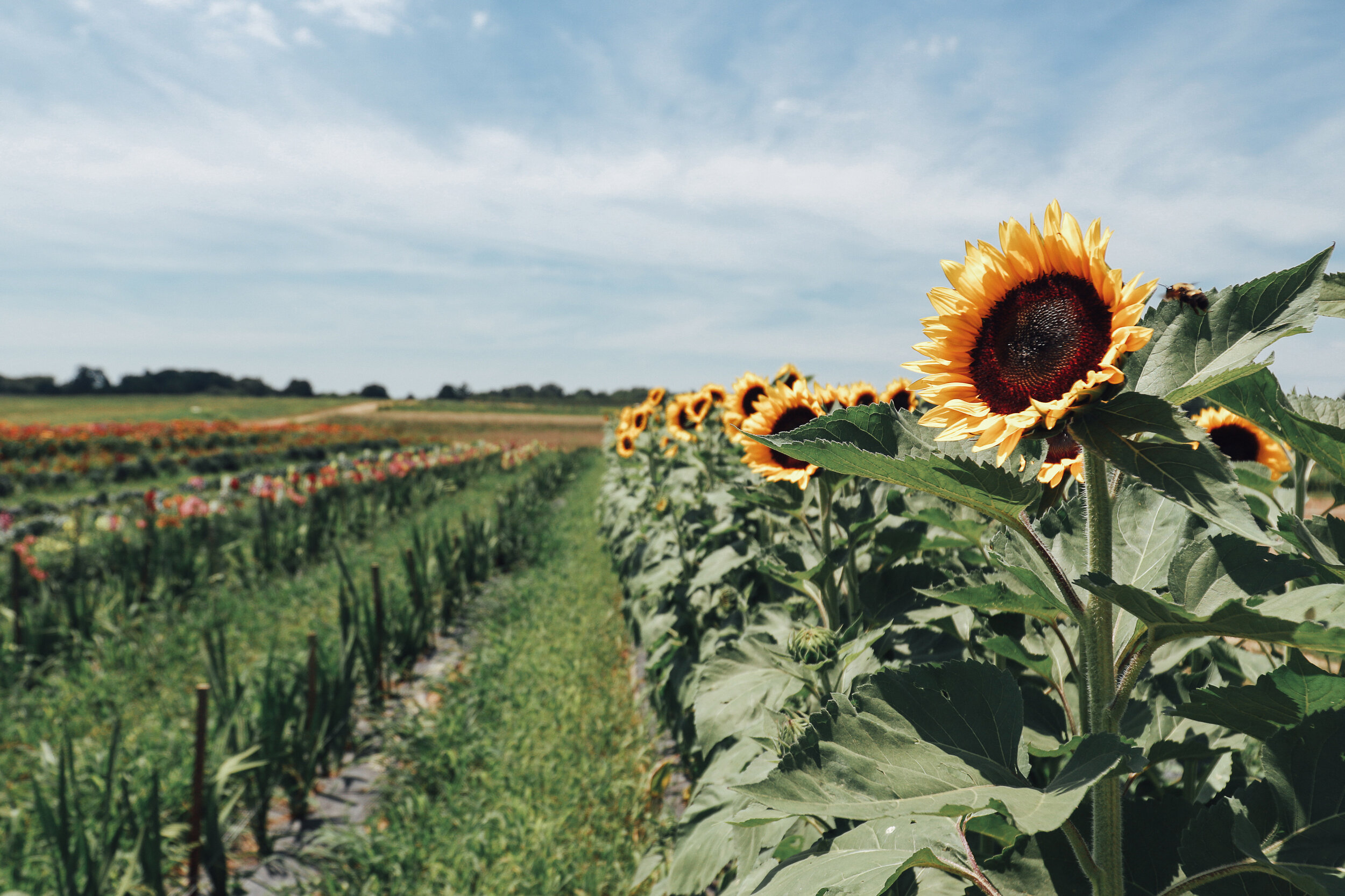
All of the copy found on the site was written by myself as well as most images photographed (see product images below) with exception to a select few events. An additional asset I created for the site was an illustrated map of the farm’s retail and event spaces. This allows customers navigating the farm to find additional parking, the lakeside pavilion rental space, or event spaces at the respective times of the year. Check out the actual site at janoskis.com >